|
 |
|
|

Member
76 posts
Registered:
Oct 2009
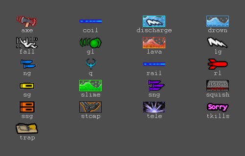
created on AAS request, here is my suggestion: I have also altered fragfile.dat to make changes working. Besides, i was thinking about custom glowing icons if weapon with quad - instead of two icons, just one. Another question to AAS, the pack contains 48x24 px, while you were saying something about resize? Gonna nag you over irc in the evening over the weekend, or maybe tomorrow when i'll be at work, download http://gfx.quakeworld.nu/details/322/ Any suggestions? Edit: Image set after suggestions.
Member
386 posts
Registered:
Apr 2006
Suicides show up as "unknown" in the current one. Can that be replaced?
Come to think of it, the same thing shows up when you fall into an abyss, eg. on skull.
Member
705 posts
Registered:
Feb 2006
the SSG does 56 damage and fires 15 pellets. 4 damage per pellet
the SG does 24 damage and fires 6 pellets, same there. 4damage per pellet.
I dont think they look appropriate somehow, with the size/damage ratio. will think of a better way to explain myself when I've gotten some sleep.
I do like the stomp and tele icons, very nice commercial grade quality for sure. thumbs up!
Also the lg and discharge icons point at different directions, is this by intent or for some specific reason?
Member
76 posts
Registered:
Oct 2009
i was thinking about making ng/sg icons smaller, but notice that with smaller icons it may become a bit unnoticeable.
discharge is on purpose in opposite direction
but havent checked that how does it look like in-game, cause i was thinking about that icon as suicide
and the fall should be updated
well at 4am I was hardly seeing at all
Member
132 posts
Registered:
Mar 2006
_KaszpiR_: 48x24 is okay. Mine do no spaek engrish!
Member
309 posts
Registered:
Sep 2006
Kaszpir - make SG icon blue and ssg yellow, just like in those popular wads. It should do. And maybe another special one for "Satan'spower deflects..." ?  Suicide/bored is also needed. Besides - great work!!
Member
76 posts
Registered:
Oct 2009
about the codes - just give me well described fragfile.dat and i can make new images.
edit: guess i found something on cvs/svn
Member
357 posts
Registered:
Nov 2008
I hate ng icon looks more like a mg, this one (the blue ng icon) looks better for qw imho  http://gfx.quakeworld.nu/details/253/ "the quieter you become, the more you are able to hear"
Administrator
891 posts
Registered:
Jan 2006
I hate ng icon looks more like a mg, this one (the blue ng icon) looks better for qw imho http://gfx.quakeworld.nu/details/253/ <- agree with time!. quite nice icons otherwise. Join us on discord.quake.world
Member
76 posts
Registered:
Oct 2009
updated first post, thanks for suggestions.
time!, bps - i think about making another set with those icons you showed.
News Writer
1267 posts
Registered:
Jun 2007
Member
76 posts
Registered:
Oct 2009
Now, looks more like final release.
Changes:
Axe - totally redone in Photoshop, due to the license limitations.
Updated fragfile.dat
Added railgun/coil icon.
Updated readme.

|
 |
 |
|