Administrator
891 posts
Registered:
Jan 2006
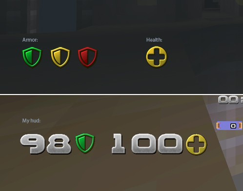
I like the hud icons they have in Quake Live, so I figured why not make this for qw?
More info over here: http://gfx.quakeworld.nu/details/310/
Numbers (by Moon[Drunk]) can be downloaded here: http://www.dayofdefeat.se/Webb-mapp/moondrunk/files/num_moon3b.zip
Join us on discord.quake.world
Member
459 posts
Registered:
Mar 2008
Member
50 posts
Registered:
Jul 2009
nice job mate, looks better in qw than it does in ql 8)
Administrator
891 posts
Registered:
Jan 2006
thanks guys, glad you like it.
Join us on discord.quake.world
Member
401 posts
Registered:
Mar 2006
Member
251 posts
Registered:
Jul 2007
Aww... I like them. Going to test them out!

Member
1 post
Registered:
Jan 1970
It's really nice.i like it.
Member
251 posts
Registered:
Jul 2007
More faces plz!

Member
309 posts
Registered:
Sep 2006
Colours of the armours should be brighter. Can yoo do it?
I can't find the numbers at the link you provided though?
Good work notwithstanding.
Member
230 posts
Registered:
Jan 2006
Nice ones Bps
I can't find the numbers at the link you provided though?
You'll find the numbers over at my place
Moon[Drunk]s Quake Graphics.
(Bps has a different version which looks a lot like Moon #3b)
Administrator
891 posts
Registered:
Jan 2006
More faces plz!
I got no idea how different faces should look? For myself I like that it's NOT changing.
Colours of the armours should be brighter. Can yoo do it?
I can't find the numbers at the link you provided though?
Good work notwithstanding.
Sure. Try these out: blaps.se/qw/icons_brighter.zip and tell me what you think about them. I made the face icon brighter too.
Join us on discord.quake.world
Member
459 posts
Registered:
Mar 2008
More faces plz!
I got no idea how different faces should look? For myself I like that it's NOT changing.
maybe a redish / orangly face for when you're low would do.
Member
309 posts
Registered:
Sep 2006
New armours look better, but for my taste even a brighter design would be nice

The face icon is still too dark.
As for different faces: blue aura surrounding the face when the quad is taken, red for pent and maybe transparent or dark for the ring?
Rikoll's clues are also worthy of consideration
Administrator
2059 posts
Registered:
Jan 2006
More faces plz!
I got no idea how different faces should look? For myself I like that it's NOT changing.
maybe a redish / orangly face for when you're low would do.
Or make it more and more transparent the lower health you get. This way you might think "eeek, almost can't even see the plus sign, now i'm fucked!"
www.facebook.com/QuakeWorld