 |
 |
|
|

Member
485 posts
Registered:
Feb 2006
Member
202 posts
Registered:
Dec 2006
']Povo: Nice charset btw. Hope you don't mind but I've changed the shadows to 50% opacity in your charset, just remember to set gl_alphafont to 1. Thanks mate. Feel free to do anything you want with it. I originally used someone else's work as a base, so it's only fair that I allow the same freedom.
Member
200 posts
Registered:
Apr 2006
To be honest the best charset ever made, IMHO, still is this: Needs a bit of work, some letters are not correctly placed, but looks great. Maybe somebody could work on a 256x256 version of it? 
Member
312 posts
Registered:
Jun 2006
Great job povohat !
Indeed jkn, i luv this charset :]
Member
119 posts
Registered:
Mar 2007
yep , i think also that this is the best one ever made , awesome in every way I will either find a way or make one !
Member
637 posts
Registered:
Jan 2006
http://slip.4.pl/ - unblocking myspace facebook firewall
Member
1435 posts
Registered:
Jan 2006
Nice charsets so far. I'd like to add that the deadline for this competition remains unspecified, it's not decided yet if we'll run a poll here before we pick the winner and when we will be shipping ezQuake 1.8 stable.
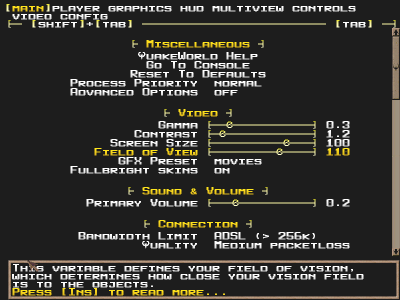
BTW, why everyone uses borders or shadows around the letters? I haven't seen a font yet without these, except for Q3 font which doesn't look ok because of the issue mentioned in the first post, but except for that it looks fine - same as in Q3. Is this contrasting element - shadow or dark border - really necessary? It is definitely not necessary in Q3.
Member
163 posts
Registered:
Jan 2006
Nice charsets so far. I'd like to add that the deadline for this competition remains unspecified, it's not decided yet if we'll run a poll here before we pick the winner and when we will be shipping ezQuake 1.8 stable.
BTW, why everyone uses borders or shadows around the letters? I haven't seen a font yet without these, except for Q3 font which doesn't look ok because of the issue mentioned in the first post, but except for that it looks fine - same as in Q3. Is this contrasting element - shadow or dark border - really necessary? It is definitely not necessary in Q3. i use it becouse its easy to read in-game.
Member
202 posts
Registered:
Dec 2006
It helps the text be read on all types of backgrounds, dark or light. I use a small black line around my crosshair for that reason. A lot of quake 3's text gets a shadow applied to it anyway, the scoreboard for example.
Administrator
886 posts
Registered:
Jan 2006
povo's submission is awesome \0/ Join us on discord.quake.world
Member
64 posts
Registered:
Mar 2006
That's my background colour (00FFFF) bleeding in thru the antialiasing of smoothfont. Here's a version with a black background download fixed pngIt would be AWESOME if someone could make matching hudnumbers.
Member
46 posts
Registered:
Jan 2006
To be honest the best charset ever made, IMHO, still is this: http://www.imbecircanalfa.br2.net/jkn/def.pngNeeds a bit of work, some letters are not correctly placed, but looks great. Maybe somebody could work on a 256x256 version of it? </lurk> I still have the Photoshop PSD file for this charset from way back when I made it. P.S. POVO's charset's for the win (always). <lurk>
Member
27 posts
Registered:
Jan 2007
There are a few small glitches with povohat's font. The shadows from the backslash and the comma bleed into the neighboring characters, right square bracket and < respectively. Might want to fix that before it ships with the new ezQuake release.
Member
202 posts
Registered:
Dec 2006
Thanks for the bug report, here's the fixed versions.
Member
200 posts
Registered:
Apr 2006
Member
355 posts
Registered:
Jun 2006
The thing is that this charset looks like an enlarged 256x256 charset. And yes, it looks great  .
Member
1754 posts
Registered:
Jan 2006
the povo one with red 2nd text
Member
163 posts
Registered:
Jan 2006
gimmie some input ----- -----
Member
485 posts
Registered:
Feb 2006
5) Uppercase and lowercase letters should differ ("hello" and "HELLO" should look different)
Member
1435 posts
Registered:
Jan 2006
Well it does, doesn't it?
Member
1100 posts
Registered:
Jan 2006
the-interceptor: Hard to read in my opinion. Looks more like a font for some logo than for actual text.
Member
27 posts
Registered:
Jan 2007
The colours look a bit unsaturated or washed out, both the coloured bubbles and the font itself. Other than that - good job!
Member
163 posts
Registered:
Jan 2006
the-interceptor: Hard to read in my opinion. Looks more like a font for some logo than for actual text. I didnt find it that hard to read  too late to change the font anyways, and it is mostly for the menus.  The colours look a bit unsaturated or washed out, both the coloured bubbles and the font itself. Other than that - good job! I actually made the saturation on purpose, so it wouldnt look too much like povos charset.
Member
485 posts
Registered:
Feb 2006
Well it does, doesn't it? No, it's all uppercase.
Member
27 posts
Registered:
Jan 2007
No, it's all uppercase. Yer, it's all upper case, but the "lower case" letters are smaller so it looks different, and that's what Johnny wanted.
Member
163 posts
Registered:
Jan 2006
Remade the 'Download Bar' to flirt a bit with the ezq crew ;P don't know if its good or bad looking, but it ain't worse then the previous i had.
Member
1011 posts
Registered:
Feb 2006
I'm working on something for this, is there any deadline for the competition? i.e., is it the next ezquake release date? :-)
News Writer
493 posts
Registered:
Jan 2006
povohat: your latest povo5 is bugged with lowercase l and w, there are trailing pixels to the right of the letters. symbols not checked.
Member
1026 posts
Registered:
Feb 2006
oh yeah.. wanted to report this, but i forgot http://img150.imageshack.us/img150/2394/sadasdasxu5.jpg
Member
202 posts
Registered:
Dec 2006
Saw that the other day. The M (follows L) starts on the very leftmost pixel of its 16x16 space. With smoothfont enabled, it bleeds into L (upper and lowercase). Assuming this is the reason, we should see some bleed on M, N, O and a couple more non-letter chars when using smoothfont. I'm not sure I can fix this without those letters looking weird.

|
 |
 |
|


